Branding, Web Design, Illustration
Working with members of CGCHealth, I rebranded their organization to better communicate who these communities are, the overall health crisis in the Amazon and CGCHealth vision to heal, educate and empower these people.
Client: CGCHealth
Interactive Design, Icon Design
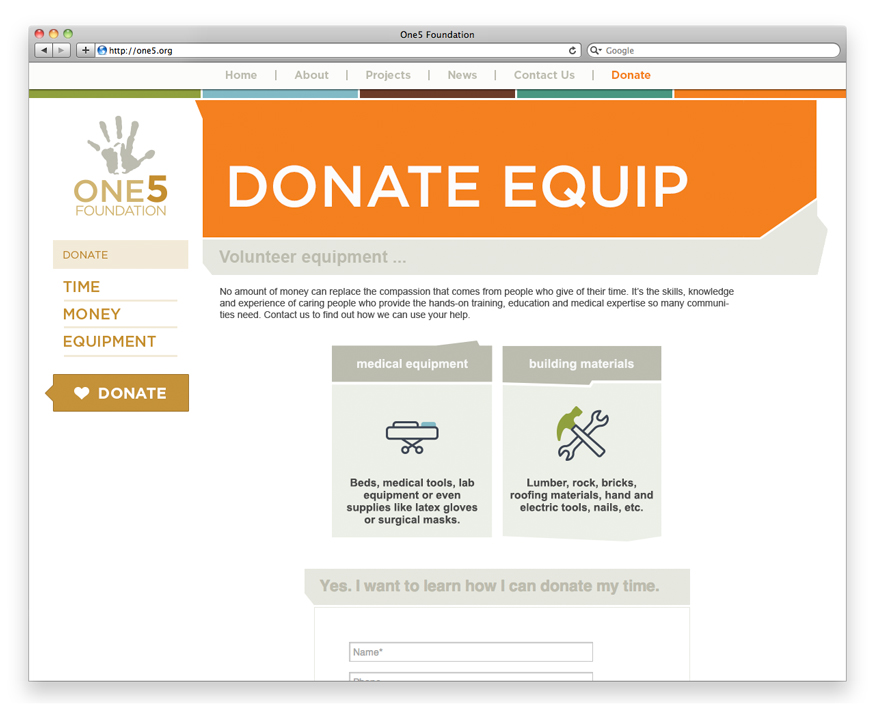
The new One5 website needed to explain their process of helping impoverished communities create a sustainable health care system. The homepage tells the story of how they help these communities through a parallax scrolling site allowing an in-depth explanation of the five resources they supply, where they work, who they are working for and how to get involved.
The resource icon set that was developed for One5 to communicate the five different aspects of their process; building, equipping, educating, healing and empowering.
The Donate icon set illustrates the different types of donations and ties them back through color to one of the five resources.
Designed at mbb+
Client: One5
UI/UX design, Web Design, Illustration,, Motion Design
Huhtamaki has made a huge effort to reduce their environmental impact through how they make products and dispose of waste. They wanted to communicate their triumphs so far on their sustainability page. We created a parallax scrolling page that illustrates four areas where they have reduced virgin materials there by preserving natural resources. By scrolling through the page you get the sense of the direct correlation between reducing a material like paperboard has on preserving our forests and lakes.
Designed at mbb+
Client: Huhtamaki
Web Design, Interactive Strategy, UI/UX design
The Chinet website needed a new approach on positioning their products with the idea of getting together. Our concept allowed their audience to see the endless possibilities that Chinet products can facilitate. Each new page showcases inspirational party scenes like a baby shower or backyard BBQ. The party planner can interact with different aspects of the scene and discover fun ideas for recipes, decorations and crafts.
Along with these inspirational party scenes we also added a section where bloggers can contribute more focused ideas like party favors, hosts gifts and diy invitations. This allows Chinet to broaden their audience by using brand influencers to advocate for Chinet products.
Designed at mbb+
Client: Chinet
Web Design, UI/UX design
The Greater Wichita YMCA website focused on user functionality, site navigation, and a new and improved search tool. Visually it needed to align with the new brand standards of YMCA. The focus was on a visual language to help guide the user through the layers of content.
Designed at mbb+
Client: The Greater Wichita YMCA
Web Design
Nueterra's website redesign focuses on a "global" message that coincides with their vision to provide care all over the world.
Designed at mbb+
Client: Nueterra
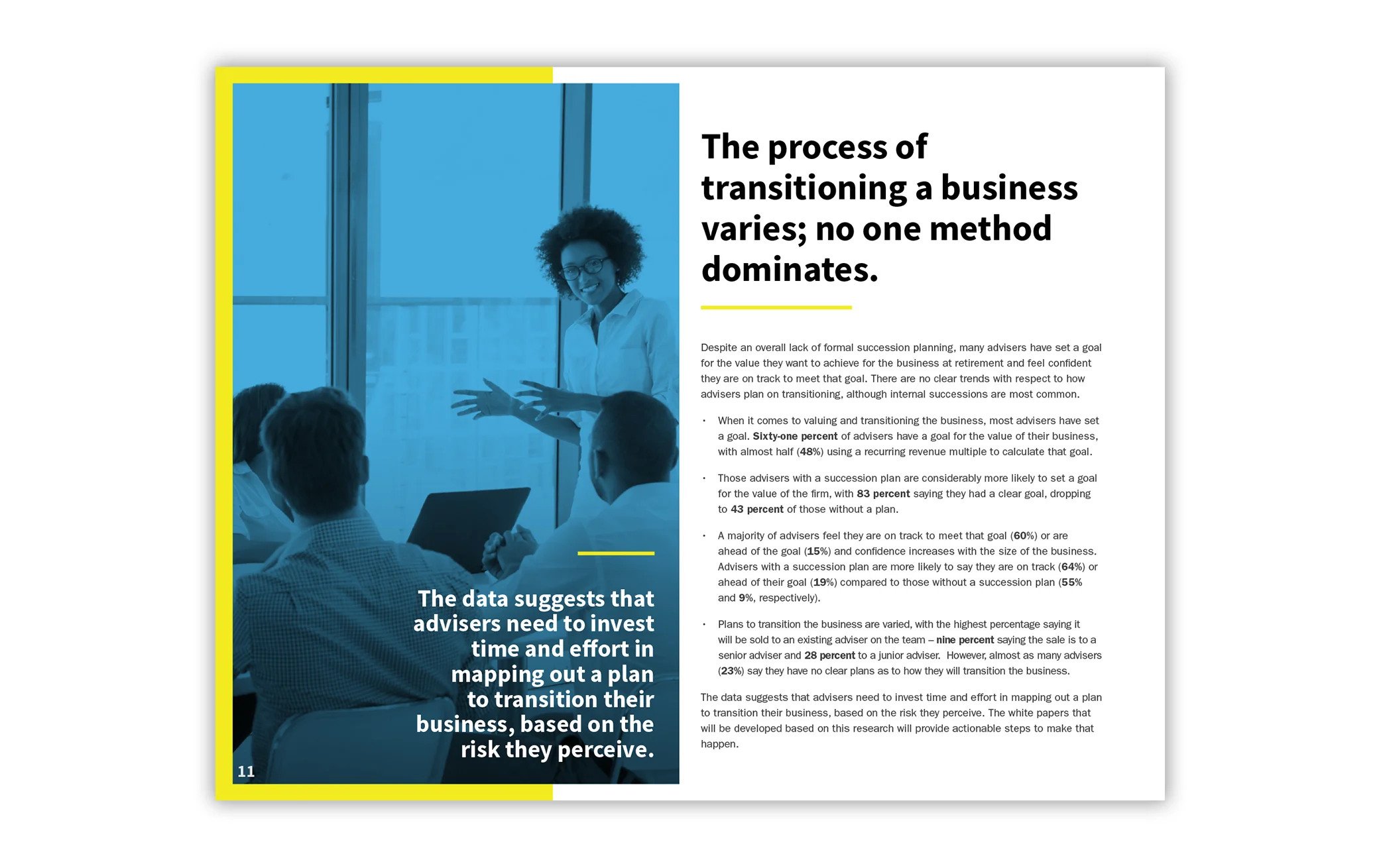
Branding, Editorial Design, Infographics
The redesign of the survey layout for the FPA Succession Challenge showcases the results in a captivating and engaging design. It highlights key concepts and data in a way that allows the information to be easily digested.
The survey provides insights for financial advisers about personal and business challenges that may impact their ability to plan for retirement.
Client: Financial Planning Association